


As a developer, exporting icons or images in PNG format makes you restricted in some ways. Changing the color of icons in different states(hover, active, etc) means you might need to have downloaded the icons in different colors signifying the states before it can be implemented.
The SVG file format gives designers and developers a lot of control over how they should appear and be styled. In this article, I will explain how you can download icons and images as SVGs from your Figma file and use a custom color of your choice.
SVG stands for scalable vector graphic files which implies that they can be expanded or reduced to any size without a loss of quality and is commonly used to render two-dimensional images on designs. Here are four steps on how you use them as react components;
STEP 1
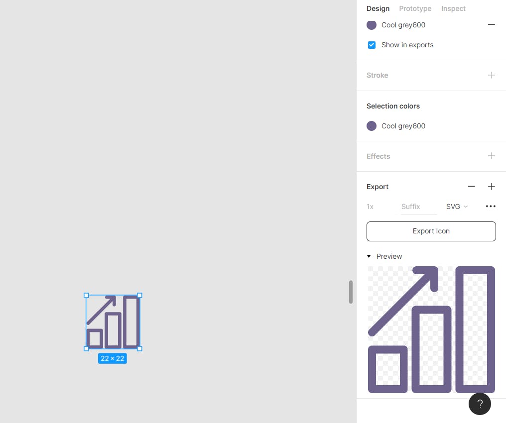
Since Figma is being used as the reference point in this article, you can open up the file and select a random icon till you are able to successfully implement this in your live projects. Make sure you do a preview of what you are downloading to be sure the whole SVG layer is selected.
STEP 2
After downloading the icon into your React app, the next thing is to import it as a ReactComponent before adding the necessary stylings to it. Also, the CSS file should be imported likewise. Your code should look like this;
import "./App.css";
import { ReactComponent as Icon } from "././images/Icon.svg";

function App() {
  return (
    <div className="card">
      <Icon className="icon" />
    </div>
  );
}

export default App;
STEP 3
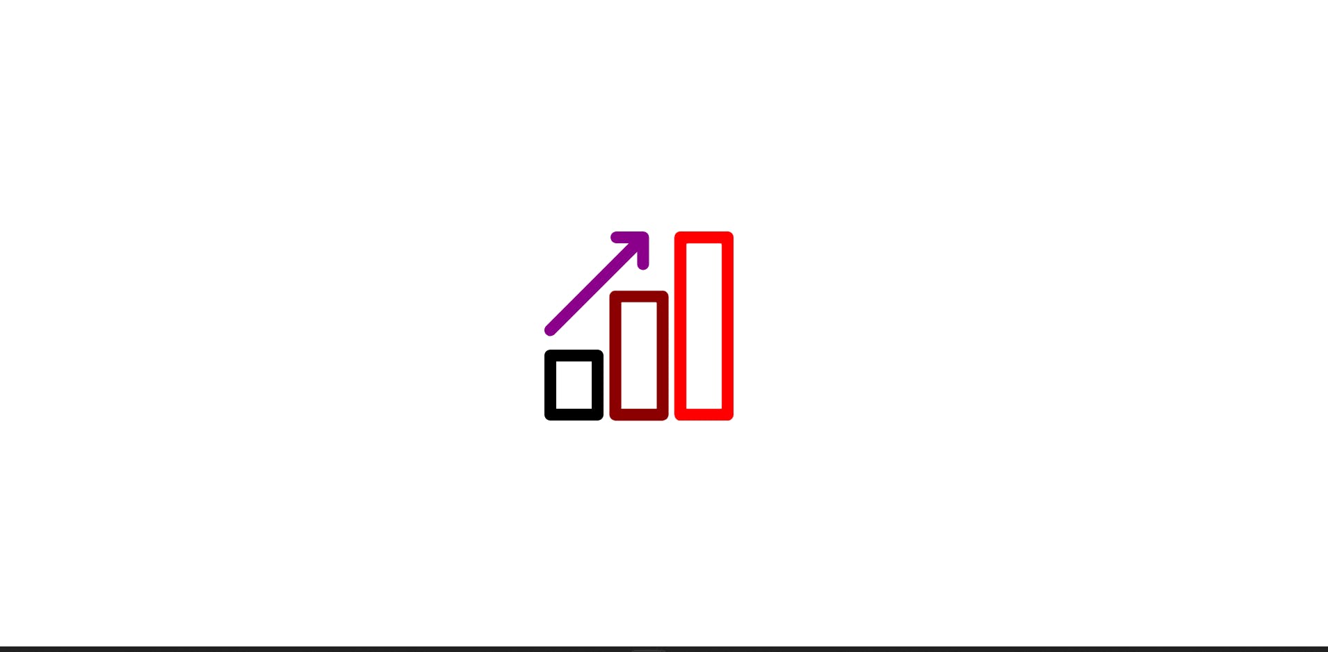
Moving on, all you need to do next is to remove all fill quotes in the SVG and give a custom color of your choice in the CSS file.
Furthermore, if you wish to style only a single path in the SVG or more, you can easily give it a "className". For example;
SVG
<svg width="22" height="22" viewBox="0 0 22 22"  xmlns="http://www.w3.org/2000/svg">
<path  className="path1" d="M21.3125 0H15.8129C15.4348 0 15.1255 0.309318 15.1255 0.687449V21.3109C15.1255 21.6891 15.4348 21.9984 15.8129 21.9984H21.3125C21.6907 21.9984 22 21.6891 22 21.3109V0.687449C22 0.309318 21.6907 0 21.3125 0ZM20.6251 20.6235H16.5004V1.3749H20.6251V20.6235Z" />
<path className="path2" d="M13.7505 6.87402H8.25093C7.87279 6.87402 7.56348 7.18334 7.56348 7.56147V21.3105C7.56348 21.6886 7.87279 21.9979 8.25093 21.9979H13.7505C14.1287 21.9979 14.438 21.6886 14.438 21.3105V7.56147C14.438 7.18334 14.1287 6.87402 13.7505 6.87402ZM13.0631 20.623H8.93838V8.24892H13.0631V20.623Z" />
<path className="path3" d="M6.18851 13.749H0.688914C0.310783 13.749 0.00146484 14.0583 0.00146484 14.4365V21.311C0.00146484 21.6891 0.310783 21.9984 0.688914 21.9984H6.18851C6.56664 21.9984 6.87596 21.6891 6.87596 21.311V14.4365C6.87596 14.0583 6.56664 13.749 6.18851 13.749ZM5.50106 20.6235H1.37636V15.1239H5.50106V20.6235Z" />
<path className="path4" d="M0.68907 12.1746C0.867816 12.1746 1.03968 12.1058 1.17712 11.9752L10.7945 2.35783V3.80156C10.7945 4.17969 11.1039 4.48901 11.482 4.48901C11.8601 4.48901 12.1694 4.17969 12.1694 3.80156V0.694285C12.1694 0.316154 11.8601 0.00683594 11.482 0.00683594H8.38159C8.00345 0.00683594 7.69414 0.316154 7.69414 0.694285C7.69414 1.07242 8.00345 1.38173 8.38159 1.38173H9.82532L0.201024 10.9992C-0.0670081 11.2672 -0.0670081 11.7003 0.201024 11.9684C0.33848 12.106 0.510342 12.1747 0.68907 12.1747V12.1746Z" />
</svg>
CSS
.path1 {
  fill: red;
}
.path2 {
  fill: darkred;
}
.path3 {
  fill: black;
}
.path4 {
  fill: darkmagenta;
}
Here's what the Icon looks like now, Exciting right?
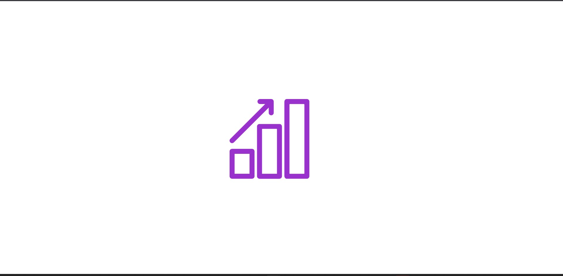
As mentioned earlier, if you wish to give the entire SVG the same color, there is no need to give each path a "className" but rather, only the SVG should be given. For example;
.icon {
  fill: darkorchid;
}
Here's what it should look like now;
STEP 4
The last and final step after changing it to a custom color of your choice while in the initial state is to also change it either in the hover or active state. Here's how to do it in the hover state;
.icon {
  fill: darkorchid;
}
.icon:hover {
  fill: firebrick;
}

Yay! 🎉 That's all you need to do to implement this in your React apps.
You can reach out to me if you have further questions and kindly drop a comment or a reaction if this article was helpful to you. Thank you!